
Now that Urban Picnic is a few weeks behind me, I finally have time to share all the projects we worked on. As with most fundraisers, the budget is always stretched paper thin and you have to find creative ways to bring an event to life without looking too crafty and home-made. Here are some things we did to create a cohesive look without a lot of money. Our 700+ person event had three areas, indoor and outdoor, that needed to be designed and our budget was roughly $1,000, achieved with many, many, many (wo)man hours and buckets of sweat equity.
1. Pick a theme and stick with it. Our theme was black and white (one spot color) which is really great for budget-minded events. We stuck to that palette for our patterns, textiles, floral arrangements, signage, and even our clothes! The fence basket and marble chess board were both estate sale finds. photo by Elizabeth Cook

* * * * * * * * * * * * * * * * * * * * * * * * *
2. Use the resources you have creatively. Buying bottles and containers for "grouping" centerpieces can be very costly. We recycled wine bottles and cans of all sizes, hit up estate sales for old jars and vases and gave it our own twist. Bottles were découpaged with old books, newspapers and law journals or primed and spray painted. Yes, it took forever, but the results were absolutely worth it.
In this window display, the large black frame was thrifted for $2 and all the bottles were recycled. The only cost was for the spray paint, Modge Podge and flowers. Top photo by Elizabeth Cook; Bottom photo by Fresh Fish Creative


* * * * * * * * * * * * * * * * * * * * * * * * *
3. Look everywhere for inspiration, especially in our great blogging community. During one of our craft nights before Urban Picnic, I had found a tutorial on how to make fabric flower pins. Rebecca took that idea and made it her own, turning pages from old books into paper flowers that worked beautifully with the live flowers and wheatgrass. She even made us all flower pins (my sister is wearing one in the picture below)! photos by Elizabeth Cook


* * * * * * * * * * * * * * * * * * * * * * * * *
I found this project on katiedid's blog and instead of Christmas carols, we adapted it to our event using food sayings and ingredients. Each letter was handcut and strung on fishing line. It looked amazing and really gave the room a lot of depth. Worth every, finger-cramping moment when you see the final results!


* * * * * * * * * * * * * * * * * * * * * * * * *
4. Wheatgrass is our friend. It's inexpensive, grows quickly and looks adorable inside. We have used it often for fundraisers and the reaction to it is always the same, people love it. Rebecca grows it in organic soil in case you want to juice it up, gives it plenty of water and sunshine and in 10 days, voilà! For this event, we grew wheatgrass in cans, milk glass and jars. The cloud in the background was re-used from the previous year's decor and the frame was a 50¢ find at a garage sale. With a bit of paint, some twine and paper flowers, it was a great art piece. Top photo by Fresh Fish Creative, Bottom two by Elizabeth Cook


* * * * * * * * * * * * * * * * * * * * * * * * *
5. Make lots of everything, you want the space to look complete and not like you ran out of money. We filled the entire space so that everywhere you turned, you'd see all the details that pulled everything together. This restaurant had a wide wall in the middle that separated two rows of booths. Hydrangeas and ranunculus lined the entire way down for drama and impact. photo by George Vial
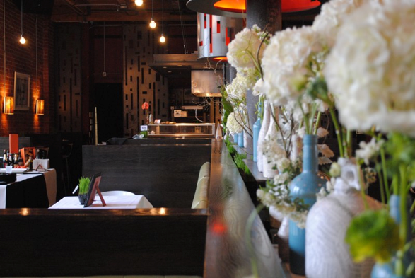
* * * * * * * * * * * * * * * * * * * * * * * * *
We found a little picnic table that once held condiments, painted it white and found four perfectly sized glass jars for a simple but fun table centerpiece for our media sponsor that evening. photo by Elizabeth Cook

* * * * * * * * * * * * * * * * * * * * * * * * *
6. Signage can get expensive. To stay on budge, we kept it simple and made as much by hand as possible. Black and white prints on card stock were popped into a painted frames for our VIP table and drink stations. photo by Elizbeth Cook

* * * * * * * * * * * * * * * * * * * * * * * * *
Using the same font and style, we printed all the restaurant names onto cardstock, trimmed them and spray mounted them to black card stock with a chopstick in the middle and stuck them inside cans of wheat grass. The menu items got the same treatment but on folded cardstock. photos by George Vial


* * * * * * * * * * * * * * * * * * * * * * * * *
I had been collecting clipboards for a while, free from the discard pile at work and some for mere pennies at garage sales. So they all got spray painted with chalkboard paint and there you have it, instant signage for our entertainment. Top photo by George Vial, Bottom photo by Elizabeth Cook


* * * * * * * * * * * * * * * * * * * * * * * * *
Design and styling was a combined effort between the talented Rebecca Thao and myself. It was all possible because of the countless hours dedicated to crafting, which we affectionately called "Sweatshop," with loads of help from our friends Lynn Klein, Mary Rivera and Trinh Trieu. Of course, there were other worker bees who helped design the website, event materials, helped set up and basically worked their butts off too. You can see our whole committee here at the Urban Picnic blog.
As much fun as we had, and as proud as I am of the event, can I say I'm glad it's over? Whew!
No comments:
Post a Comment